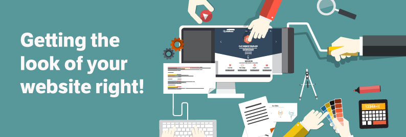
When it comes to website design, looks really do matter. The internet is a competitive place where millions of websites vie for viewers’ attention. Therefore, it’s not enough that your website is simple, easy-to-navigate and effective; it has to draw web users in from the first moment they see it. Luckily, creating a website which grabs users’ interest isn’t as hard as it sounds! Here at Image Concepts, we like to think we know all the secrets to great visual design. What’s more, we’d like to share some of them with you!
1. Invest in high-quality photography
A great website should feature great photographs. If you want to engage your viewers, you can’t rely on readily-available stock photos or pictures that you’ve taken yourself. Most web users are savvy enough to know a generic or cheaply produced image when they see one, so it’s worth investing in professionally produced images. You can either hire a photography team to produce new images specifically for your website, or pay to use existing (but appropriate) copyrighted images. Either way, viewers will instantly think that your site looks professional and therefore will take your business more seriously.
2. Avoid colour chaos
Viewers will abandon a site almost immediately if its colour scheme appears garish or poorly conceived. However, there’s a simple way to make sure your site’s colour scheme looks stunning. Simply design your site in greyscale first, and then work out where you should put colour afterwards. Seeing what the site looks like without colour gives you a neutral starting point, which makes it easier to see which colours would look great on each part of your site. You should also restrict yourself to two main colours that either complement each other or present an effective contrast. This will help ensure that your website looks tasteful and effective and prevent it from looking over-the-top. It’s easy for viewers to tell the difference between a professional colour scheme and an amateurish one before they’ve even looked at a site in detail. Don’t waste the opportunity to impress them!
3. Use white space effectively
Blocks of text, images and other forms of visual stimuli need space. Every piece of information and every feature of each of your site’s pages should be surrounded by a little unused space. The reason for this is simple: if the components of a web page are too close together, they appear crowded and confusing. A viewer who opens a web page and sees a congested muddle of content is likely to close that web page again pretty quickly. Remember to use white space to make your content appear well organised and easier to take in!
Attracting viewers’ attention from the moment they arrive on your website is vital, because they’re likely to leave if you don’t. In order to convert viewers into customers, you need to make them want to spend time on your site, and excellent visuals are an important part of that. Luckily, excellent visuals aren’t hard to achieve; simply by following the tips presented in this blog entry, you can make sure that your site looks good enough to entice any web user.
If you would like to see how we can help give your website a lift simply complete our website quote request form and we will be in contact.